Accessibility Audit: A Practical Checklist Beyond Lighthouse Scores
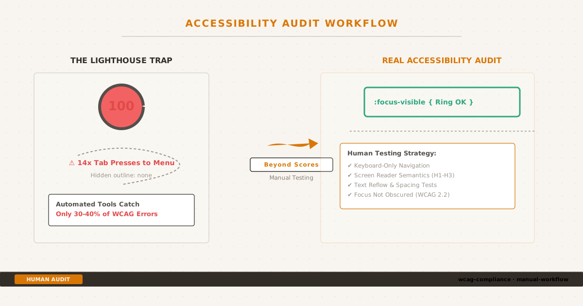
Beyond automated scores: Finding hidden WCAG failures through manual keyboard navigation and screen reader audits.
The Lighthouse Trap#
When I wrote about chasing a perfect Lighthouse score, I hit Performance 100, Accessibility 100, Best Practices 100, and SEO 100. The contrast fixes, the CLS reductions, the aria-label additions — that’s what got me there.
Then I disconnected my mouse and tried to navigate my own site.
The theme toggle — the one with the aria-label="Toggle theme" that scored perfectly in Lighthouse — was buried in a tab order that required 14 Tab presses to reach. The skip link existed in the HTML but was visually hidden with opacity: 0 and never received focus. The code block copy buttons were invisible until I hovered — I couldn’t tell they existed, let alone press them.
Lighthouse said 100. My keyboard said otherwise.
This is the accessibility trap: automated tools catch roughly 30–40% of real-world WCAG violations. The rest requires a human, a keyboard, and a systematic workflow. The WebAIM Million 2026 report analyzed a million homepages and found that 95.9% had detectable WCAG failures — and the same six failure types have dominated for seven consecutive years.
This post is the audit workflow I developed after that humbling experience. It’s not a WCAG encyclopedia. It’s a checklist you can run in 5–8 hours on a 10–50 page site and catch the issues that Lighthouse misses.
The Audit Workflow#
I structure every audit in five phases, ordered from fastest/cheapest to most time-intensive. Each phase catches issues the previous one can’t.
Phase 1: Automated Baseline (15–30 minutes)#
Run all three tools on your key templates — homepage, a blog post, an archive page, and a contact/form page if one exists.
| Tool | What it catches | Limitations |
|---|---|---|
| axe DevTools | Missing alt, contrast, form labels, ARIA errors, target size | Single page; free tier limited |
| WAVE | Visual overlay of issues, structure, landmarks | No CI/CD; some false positives |
| Lighthouse | Score tracking, subset of axe rules (~50 vs ~90) | Score can mislead; fewer rules than axe |
Run all three because they overlap imperfectly. Lighthouse found 4.2 issues per site in a 50-site comparison; axe found 7.8 — nearly double. Use Lighthouse for score tracking, axe for actual issue detection.
Export results. Deduplicate template-level issues (if the nav fails once, it fails on every page that uses the same nav). Categorize: critical → serious → moderate → minor.
Then close the browser extensions. The automated phase is done. Everything below requires you.
Phase 2: Keyboard Navigation (1–2 hours)#
Disconnect your mouse or push it aside. This is the phase that catches the most issues on content-heavy sites.
Navigate every page template using only: Tab, Shift+Tab, Enter, Space, Arrow keys, Escape. Check each of these:
Focus visibility (WCAG 2.4.7): Every interactive element must show a visible focus indicator when tabbed to. Not a subtle one — a clear, unambiguous ring or outline. I use a 2px solid outline with a contrast ratio that passes against the background. If you’ve removed the default outline: none without providing a replacement, this is where you’ll find it.
/* My approach: visible focus for keyboard, hidden for mouse */
:focus-visible {
outline: 2px solid var(--accent);
outline-offset: 2px;
}Logical tab order (WCAG 2.4.3): The tab order should match the visual reading order. If your sidebar appears to the left of the content but is last in the DOM, keyboard users will tab through footer links before reaching main content. Check: does Tab move through header → main content → sidebar → footer in a logical sequence?
No keyboard traps (WCAG 2.1.2): Tab into every interactive element. Can you Tab out of it? If you’re trapped in a widget with no way to reach the next element, that’s a keyboard trap. Common offenders: custom dropdowns, modals that don’t trap focus correctly, embedded iframes.
Skip link (WCAG 2.4.1): Does a skip link appear on Tab-1? Does it actually move focus to the main content? Many sites include a skip link in the HTML that’s visually hidden with display: none or visibility: hidden — both of which remove it from the focus order. The skip link must be visible on focus.
All functionality operable (WCAG 2.1.1): Can you open navigation menus with Enter/Space? Can you close modals with Escape? Can you navigate a carousel with arrow keys? If any interaction requires a mouse click, it fails.
Phase 3: Screen Reader Basics (30–60 minutes)#
You don’t need to become a screen reader expert. You need 30 minutes with NVDA or VoiceOver to catch the issues that keyboard testing can’t surface.
Quick-start (5 minutes):
- Windows: Install NVDA (free, open source). Press Ctrl+Alt+N to start.
- macOS: VoiceOver is built-in. Press Cmd+F5 to toggle.
- Navigate by headings: Press H in NVDA / VO+Command+H in VoiceOver. Does the heading hierarchy make sense? Can a screen reader user jump from H2 to H2 and understand the page structure?
- Navigate by landmarks: Press D in NVDA / VO+Command+L in VoiceOver. Are there landmarks? Are they labeled?
<main>,<nav>,<header>,<footer>should exist and be distinct. - Tab through one page: Do form labels announce? Do buttons announce their purpose? Do images announce their alt text?
What to check:
- Heading hierarchy (WCAG 1.3.1): H1 → H2 → H3, no skips. Screen reader users navigate by headings more than any other mechanism. If your headings are styled
<div class="h2">instead of<h2>, the heading structure is invisible to assistive technology. - Image alt text quality (WCAG 1.1.1): Not just “present” — meaningful.
alt="screenshot"tells a screen reader user nothing.alt="Terminal showing git rebase output with three commits squashed into one"tells them exactly what the image demonstrates. For decorative images, usealt=""— empty but present. - Link text quality (WCAG 2.4.4): “Click here” and “Read more” are meaningless out of context. Screen readers often navigate by listing all links on a page — “Read more” repeated 20 times is useless. Use descriptive link text: “Read more about the contrast fix” or “View the git shallow clone post.”
- Form labels (WCAG 3.3.2): Every form input must have an associated
<label>. Placeholders are not labels — they disappear on input and often fail contrast requirements.
For deeper screen reader testing, see the WebAIM screen reader testing guide. The key insight from WebAIM’s survey: screen reader users primarily navigate by headings and landmarks — both of which require proper HTML semantics.
Phase 4: Visual & Content Review (1 hour)#
Color contrast (WCAG 1.4.3): WCAG AA requires 4.5:1 contrast ratio for normal text, 3:1 for large text (18px+ or 14px+ bold). I learned this the hard way when my amber accent color at 3.19:1 failed against the dark background. Use the WebAIM Contrast Checker for precise measurements.
The contrast formula:
contrast = (L1 + 0.05) / (L2 + 0.05)Where L1 is the relative luminance of the lighter color and L2 is the relative luminance of the darker color.
Text reflow (WCAG 1.4.10): Zoom to 320px viewport width (or 400% text zoom). Does the content reflow into a single column without horizontal scrolling? Fixed-width code blocks are the most common failure — if your <pre> elements have overflow-x: hidden or force horizontal scroll, keyboard users can’t reach content that’s off-screen.
Text spacing (WCAG 1.4.12): Apply these values via browser dev tools or a bookmarklet:
- Line height: 1.5× font size
- Paragraph spacing: 2× font size
- Letter spacing: 0.12× font size
- Word spacing: 0.16× font size
If content overlaps, gets clipped, or becomes unreadable with these values, it fails. This criterion exists because users with low vision often override text spacing — your layout must accommodate that.
Link text quality: Scan every link. “Click here”, “Read more”, “Learn more” without surrounding context all fail WCAG 2.4.4. The fix is simple: make link text describe the destination.
Error handling (WCAG 3.3.1, 3.3.3): Submit any form with invalid data. Are error messages specific? “Invalid input” is not specific. “Please enter a valid email address” is. Are errors associated with the input field programmatically? Can screen reader users identify which field has the error?
Phase 5: WCAG 2.2 New Criteria (30 minutes)#
WCAG 2.2 added nine new success criteria in October 2023. Five are Level AA — required for AA conformance. Here’s the relevance breakdown for a content-heavy site:
Directly applicable to blogs#
2.4.11 Focus Not Obscured (Minimum): When an element receives keyboard focus, at least part of it must not be hidden behind sticky headers, consent banners, or floating UI. Test by tabbing to elements directly below your sticky navigation — can you see the focus indicator?
This is the most common WCAG 2.2 failure on blogs. Sticky headers are everywhere, and developers rarely test what happens when a focused element sits directly beneath one.
Fix: add scroll-padding-top to account for the sticky header height:
html {
scroll-padding-top: 80px; /* height of sticky header + breathing room */
}2.5.8 Target Size (Minimum): Interactive targets must be at least 24×24 CSS pixels. Nav links, icon buttons, social sharing icons — measure them. If your nav links are 12px text with 4px padding, the total clickable area might be under 24px.
Exception: if the target has adequate spacing around it (at least 24px in each direction), it can be smaller. But “adequate spacing” means no other interactive element within 24px.
Relevant if you have help/contact features#
3.2.6 Consistent Help: If your site has a contact link, help section, or FAQ, the link must appear in the same relative position across pages. If the contact link is in the footer on your homepage but hidden in a dropdown on your about page, it fails. The fix is straightforward: keep help mechanisms in a consistent location.
Not applicable for static content sites#
2.5.7 Dragging Movements: Requires a single-pointer alternative for any drag-and-drop interaction. Not relevant for a static blog without sliders, sortable lists, or drag-and-drop UI.
3.3.8 Accessible Authentication (Minimum): Requires alternatives to cognitive function tests (CAPTCHAs, puzzle logins). Not relevant for a site without authentication.
The Checklist#
This is the condensed version — the items that matter most for a content-heavy site. Print it, pin it, run through it before every major release.
Structural#
- [ ]
<html lang="en">(or appropriate language) present — WCAG 3.1.1 - [ ] Page
<title>is unique and descriptive — WCAG 2.4.2 - [ ] Heading hierarchy: H1 → H2 → H3, no skipped levels — WCAG 1.3.1
- [ ] Landmarks exist:
<header>,<nav>,<main>,<footer>— WCAG 1.3.1 - [ ] Lists use
<ul>/<ol>, not styled<div>s — WCAG 1.3.1 - [ ] Data tables use
<th>,<caption>, proper scope — WCAG 1.3.1
Interactive#
- [ ] All functionality operable via keyboard — WCAG 2.1.1
- [ ] Visible focus indicator on every interactive element — WCAG 2.4.7
- [ ] No keyboard traps — WCAG 2.1.2
- [ ] Skip link present and functional — WCAG 2.4.1
- [ ] Tab order matches visual reading order — WCAG 2.4.3
- [ ] Focus not obscured by sticky headers — WCAG 2.4.11
- [ ] Interactive targets ≥ 24×24px or have adequate spacing — WCAG 2.5.8
- [ ] Modals trap focus, close with Escape — WCAG 2.1.2
Visual#
- [ ] Text contrast ≥ 4.5:1 against background — WCAG 1.4.3
- [ ] Large text contrast ≥ 3:1 — WCAG 1.4.3
- [ ] Non-text contrast ≥ 3:1 (UI components, icons) — WCAG 1.4.11
- [ ] Content reflows at 320px width without horizontal scroll — WCAG 1.4.10
- [ ] Text spacing overrides don’t break layout — WCAG 1.4.12
- [ ] Content visible at 200% and 400% zoom — WCAG 1.4.4
Content#
- [ ] All meaningful images have descriptive alt text — WCAG 1.1.1
- [ ] Decorative images use
alt=""— WCAG 1.1.1 - [ ] Link text is descriptive (no “click here”) — WCAG 2.4.4
- [ ] Form inputs have associated
<label>elements — WCAG 3.3.2 - [ ] Error messages are specific and programmatically associated — WCAG 3.3.1
- [ ]
prefers-reduced-motionrespected for animations — WCAG 2.3.3
WCAG 2.2 Additions#
- [ ] Focused elements not entirely hidden by sticky UI — WCAG 2.4.11
- [ ] Interactive targets meet minimum size — WCAG 2.5.8
- [ ] Help mechanisms in consistent location — WCAG 3.2.6
- [ ] No dragging-only interactions (if applicable) — WCAG 2.5.7
- [ ] No cognitive function tests without alternatives (if applicable) — WCAG 3.3.8
Tools Reference#
A practical stack, organized by team type:
Solo Developer / Small Blog (Free)#
| Tool | Purpose | Why this one |
|---|---|---|
| axe DevTools | Browser extension, automated scanning | Zero false positives, ~90 rules |
| WAVE | Visual overlay, structural analysis | Intuitive, no data sent to servers |
| Lighthouse | Score tracking, CI integration | Built into Chrome DevTools |
| NVDA / VoiceOver | Screen reader testing | Free, industry standard |
| WebAIM Contrast Checker | Precise contrast measurement | Web-based, instant results |
Dev Team with CI/CD#
| Tool | Purpose |
|---|---|
| axe-core in Playwright/Cypress | Automated regression testing |
| Pa11y CI | Threshold-based gating in pipelines |
| axe DevTools Pro | Guided manual testing workflows |
| Accessibility Insights | Structured manual audit flows |
Full Compliance#
| Tool | Purpose |
|---|---|
| All of the above | Combined automated + manual |
| Annual professional audit | External validation |
| User testing with assistive technology | Real-world validation |
Key comparison: In a 50-site study, Lighthouse found 4.2 issues per site (27 rules); axe found 7.8 issues per site (56 rules). Use both — Lighthouse for score tracking, axe for actual detection.
The Bottom Line#
Accessibility is not a score. It’s not a number on a dashboard that you chase until it hits 100 and then forget about. It’s a practice — a way of building that accounts for the full diversity of how people interact with the web.
The audit workflow in this post takes 5–8 hours. That’s not nothing. But it catches the 60–70% of issues that automated tools miss, and it gives you a concrete framework for the next time you ship something new.
Run the audit once. Fix what you find. Then build the checklist into your workflow so you catch these issues before they ship — not after.
This post is part of my ongoing attempt to document the practical workflows I use building this blog. The contrast work that led to a perfect Lighthouse accessibility score was the starting point — this is the full picture. The site source is on GitHub.