The Color Optimization Trap: When Good Enough Is Better Than Perfect
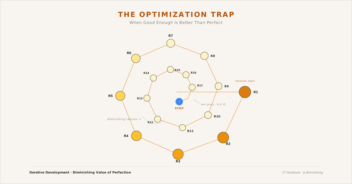
The spiral of iteration: 17 rounds converging on diminishing returns
The difference between #b6bac4 and #ced2dc is 24 points of lightness. Luminance difference of 0.15. A gap that, by any rational measure, no reader would ever consciously detect.
And yet I stared at them like they held the secret to readable typography.
This is the story of how a routine text hierarchy refinement turned into a deep-dive on Weber-Fechner laws, Apple’s HIG contrast conventions, and the uncomfortable truth about diminishing returns in design decisions. It is not a story about finding the perfect color. It is a story about learning to recognize when “good enough” is actually better.
How It Started#
It began with a simple goal: harmonize the light and dark mode text hierarchies on this blog. The old system worked — it passed WCAG AA, the hue family was consistent — but the relationship between body and secondary text felt asymmetric. In light mode the gap was wide enough to drive content through. In dark mode, secondary text sat uncomfortably close to body, like someone standing too near in an elevator.
The fix seemed straightforward. Shift a few luminance values, adjust the gaps, done.
What followed was not straightforward.
The Spiral#
Round one: darken light mode body, brighten dark mode body. Problem solved — except now the heading felt disconnected from the new body.
Round two: adjust headings to match. Better — but secondary text now felt too heavy against the new body values.
Round three: brighten secondary in both modes. Good — but tertiary text lost its role.
Round four through seventeen: you get the idea.
Every adjustment exposed another imbalance. Every “fix” created a new inconsistency somewhere else. The system, I realized, was not a collection of independent values. It was a network. Pull one node and the entire graph shifts.
The Research Detour#
Somewhere around round nine, I stepped back and asked: what does the industry actually do?
The answer surprised me. Not because it was complex, but because it was absent. There is no published standard for the ideal luminance ratio between body text and secondary text. WCAG regulates contrast against backgrounds — not the gap between two foreground colors. Every design system makes its own call.
Apple’s approach is opacity-based: secondary text at 60% of the label opacity, tertiary at 30%. Material 3 defines on-surface-variant as a contextual token whose luminance relationship shifts with the theme. Both systems accept — even expect — different gap ratios in light versus dark mode.
The most useful discovery was that Material 3’s dark mode body-to-secondary gap is around 2.0:1, almost identical to the 1.86:1 I had arrived at through iteration. Google’s team, with all their resources and user research, had landed in the same neighborhood.
That was the moment the spiral loosened its grip. If industry leaders settled for similar numbers, what was I chasing?
The Weber-Fechner Insight#
Dark mode text gaps are narrower than light mode because the human visual system processes luminance on a logarithmic scale — Weber-Fechner law, a principle as old as psychophysics itself. The same absolute brightness difference that creates a crisp hierarchy in sunlight feels compressed in low light. This is not a design flaw. It is biology.
You cannot fix biology with HSL tweaks.
Once I accepted that dark mode secondary text would always sit closer to body text than its light mode counterpart — and that this is normal, expected, even desirable — the iterative loop collapsed. Not because I found the perfect value. Because I recognized that the remaining “problem” was not a problem.
The Checklist That Ended It#
I wrote three rules to prevent future spirals:
- Does the value pass WCAG AA against its background? (Yes → continue. No → fix.)
- Is the hue family consistent across all text levels and both modes? (Yes → continue. No → fix.)
- Does the gap between levels feel intentional when tested in an actual reading session? (Yes → stop. No → fix one level, then stop anyway.)
Rule three is the hard one. “Intentional” is not the same as “perfect.” Intentional means you made a deliberate choice and you can articulate why. Perfect means you keep iterating until you forget what you were optimizing for.
What I’d Do Differently#
If I could restart this process, I would set a time budget before touching the first hex value. Two hours for research, two hours for implementation, one hour for testing. When the timer runs out, ship it.
I would also start with the research — Apple, Material, WebAIM — before opening DevTools. Most of the answers were already out there. I just needed to look before I started tweaking.
The Closing#
The final dark mode body text on this blog is #b6bac4. It is not the perfect gray. There is no perfect gray.
But it is a gray I chose deliberately, with context, with reference to industry patterns, and — most importantly — with the willingness to stop iterating.
That last part is the skill that matters more than any color wheel intuition. Design is a process of infinite refinement bounded by finite resources. The best practitioners are not the ones who find the absolute optimum. They are the ones who know, with confidence, when to close the file.
This post is part of a series on the terminal redesign and the gray hue deep-dive. The complete CSS color tokens for this blog are open source on GitHub.