@scope: Component Styles Without BEM, CSS Modules, or Shadow DOM
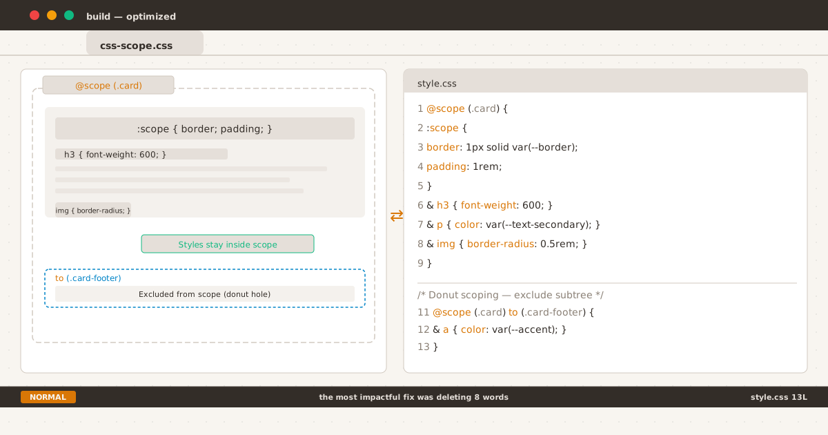
@scope boundary keeps card selectors contained; donut scoping excludes the footer.
man css-scope
Every CSS codebase eventually hits the same wall: the global namespace.
A utility class meant for one page breaks another. A component refactor spirals into a specificity war. You add a !important to override an override, and somewhere a designer twitches.
The industry built conventions and tools to manage this — BEM, CSS Modules, CSS-in-JS, Shadow DOM. Each solves the leak problem, each introduces a new one: verbose HTML, build tooling, runtime cost, or broken cascade.
In 2026, CSS finally has a native solution. @scope is Baseline across all major browsers — Chrome 118+, Firefox 146+, Safari 17.4+. Scoped styles without build steps, without naming conventions, without JavaScript.
The Problem: CSS Leaks#
CSS is global by default. Any selector can match any element anywhere in the DOM:
.card h3 { font-weight: 600; }This rule applies to every <h3> inside any .card, regardless of intent. If another component uses .card for a different purpose, the styles collide.
Real-world solutions before @scope:
| Approach | How it works | Trade-off |
|---|---|---|
| BEM | .card__heading--featured | Verbose class names, convention not enforced |
| CSS Modules | Build-time class hashing | Couples CSS to bundler |
| CSS-in-JS | Runtime style injection | Bundle size, runtime cost |
| Shadow DOM | True DOM isolation | Kills the cascade, requires JS |
None of these are bad — they got us this far. But they’re workarounds for a language-level feature that was missing for 25 years.
@Scope Basics#
@scope restricts selectors to a subtree of the document:
@scope (.card) {
:scope {
border: 1px solid var(--border);
border-radius: 8px;
padding: 1rem;
}
& h3 { font-weight: 600; }
& p { color: var(--text-secondary); }
& img { border-radius: 0.5rem; }
}How it works:
:scopetargets the scoping root — the.cardelement itself. Specificity is(0,1,0).& h3desugars to:is(.card) h3— zero specificity from the root,(0,0,1)forh3.- Everything inside
@scope (.card)can only match descendants of.card.
The critical difference from just using .card h3: the scoped rule cannot leak. No element outside a .card can be matched by selectors inside this block.
Inline Scope#
Without a prelude, @scope uses the parent element as the root:
<div class="post-card">
<style>
@scope {
:scope { padding: 1rem; }
h2 { font-size: 1.25rem; }
}
</style>
<h2>Post Title</h2>
</div>Each <style> block scopes to its parent element. Drop the same markup twice on a page — no bleed between instances.
Donut Scoping#
The to keyword creates an exclusion boundary — a lower limit where styles stop applying:
@scope (.card) to (.card > .card-footer) {
& p { line-height: 1.7; }
& a { color: var(--accent); }
}Elements inside .card-footer are excluded from the scope. The “hole in the donut” is where a nested component takes responsibility for its own styling.
This is unique to @scope — no other CSS mechanism lets you define a top boundary (inclusive) and a bottom boundary (exclusive) for where selectors match:
@scope (.media-object) to (:scope > .content) {
/* Media-object chrome. Inner .content is excluded. */
}Important caveat: @scope provides selector isolation, not style isolation. Inherited properties like color, font-family, and font-size still pass through the donut hole. Only direct selector matching is blocked.
Try it: @scope demo
Proximity: A New Cascade Tier#
@scope introduces scoping proximity to the cascade — a new tiebreaker between specificity and source order:
- Importance (
!important) - Cascade Layers (
@layer) - Specificity
- Scoping Proximity ← new
- Source Order
When two @scope blocks produce conflicting declarations for the same element, the rule whose root is closer in the DOM tree wins:
@scope (.light) {
:scope { background: #ccc; }
a { color: black; }
}
@scope (.dark) {
:scope { background: #333; }
a { color: white; }
}<div class="light"> <!-- scope root → 1 hop to <a> -->
<a href="#">Link 1</a> <!-- → light wins -->
<div class="dark"> <!-- scope root → 2 hops to <a> -->
<a href="#">Link 2</a> <!-- → dark wins (1 hop vs 2) -->
</div>
</div>Proximity is a tiebreaker — it only activates when specificity and layers are equal. It does not override higher specificity.
This makes nested theme switching declarative: the nearest scope root determines the styles, without !important or specificity hacks.
Real-World Refactor: Applied to This Blog#
After writing this post, I applied @scope to three components in this blog’s CSS. Here’s what the refactor looks like.
Homepage Terminal#
The homepage terminal has prompt characters, command text, output lines, and a blinking cursor — all grouped under .home-terminal:
/* Before: every selector repeats the parent */
.home-terminal .cmd { color: var(--accent); }
.home-terminal .output { color: var(--text-secondary); margin: ...; line-height: 1.8; }
.home-terminal .output a { color: var(--accent); text-decoration: underline; }
/* After: co-located inside @scope */
@scope (.home-terminal) {
:scope { font-family: "JetBrains Mono", monospace; max-width: 618px; margin: 0 auto; }
& .cmd { color: var(--accent); }
& .output { color: var(--text-secondary); margin: ...; line-height: 1.8; }
& .output a { color: var(--accent); text-decoration: underline; }
& .blinking-cursor { color: var(--accent); animation: cursor-blink 1.1s step-end infinite; }
}Seven separate global rules consolidated into one self-contained block.
Code Blocks (Every Post)#
More impactful — the blog’s syntax-highlighted code blocks appear on every post. The @scope block organizes all the scattered styles for .shiki, .code-wrapper, and .copy-btn into a single component boundary:
@scope (.shiki) {
:scope {
font-variant-ligatures: none;
box-shadow: 0 1px 3px color-mix(in srgb, var(--accent) 10%, transparent);
}
& .code-wrapper { display: block; padding: 1rem 1.25rem; overflow-x: auto; }
& code { background: none; padding: 0; }
& .copy-btn { position: absolute; top: 0.5rem; right: 0.5rem; ... }
&:hover .copy-btn { opacity: 1; }
& .copy-btn.copied { opacity: 1; color: var(--accent); pointer-events: none; }
}Global styles for pre (background, border, radius) stay as fallback for older browsers — progressive enhancement at work.
The same @scope boundary also made it possible to layer terminal-UI elements inside code blocks without selector bloat:
- Vim status bar (
.code-statusbar,.status-mode,.status-info) — the amberNORMALlabel and language │ line count info, scoped under@scope (.shiki). $ catprompt (.prompt,aria-hidden="true") — injected before<code>, isolated by the same scope boundary.
Without @scope, each new element would need manual namespace prefixing (.shiki .code-statusbar, .shiki .status-mode) or risk style leakage. The scope boundary keeps all code-block chrome self-contained.
Note: the 404 page’s .curl-block component was intentionally left out of the refactor. Because it uses a .curl-block--error modifier to switch accent colors to red (var(--error)), the modifier rules need higher specificity than the base — something @scope’s zero-specificity & can’t guarantee when competing with global overrides.
@scope + & (Nesting) Specificity#
Inside @scope, & and :scope behave differently:
| Selector | Specificity | Desugars to |
|---|---|---|
& h3 | (0,0,1) | :where(.card) h3 — root contributes zero via :where() |
:scope h3 | (0,1,1) | Class + element |
Bare h3 | (0,0,1) | Implicit :where(:scope) prepended |
& & | Valid | Nested .card inside .card |
:scope :scope | Invalid | Cannot match root inside root |
With multiple scope roots, & picks up the highest specificity:
@scope (#sidebar, .card) {
& img {
/* desugars to: :is(#sidebar, .card) img */
/* specificity = (1,0,0) + (0,0,1) = (1,0,1) */
}
}@scope vs BEM vs CSS Modules vs Shadow DOM#
| Feature | @scope | BEM | CSS Modules | Shadow DOM |
|---|---|---|---|---|
| Build tools needed | No | No | Yes | No (but JS) |
| Isolation | Selector-based | Convention only | Hashed classes | DOM boundary |
| Donut scoping | Yes | No | No | No |
| Proximity cascade | Yes | No | No | No |
| Runtime cost | 0 KB | 0 KB | ~0 KB | 0 KB |
| Class name style | Natural | Verbose | Auto | Natural |
| Inheritance leakage | Yes (by design) | Yes | Yes | No (full wall) |
| Global cascade leaks in | Yes (by design) | Yes | Yes | No |
When to use what:
- BEM still works fine for small projects or when you want zero dependencies without caring about selector length.
- CSS Modules are great when you’re already on a build step and want hashed isolation.
- Shadow DOM is the right choice for third-party widgets where hard encapsulation matters.
- @scope fits everything in between — component-based architectures, design systems, static sites, and server-rendered apps where you want scoped styles without tooling overhead.
The practical byte count from a card component benchmark:
| Approach | CSS bytes | HTML bytes | Total |
|---|---|---|---|
| BEM | 412 | 524 | 936 |
| CSS Modules | 318 | 380 + JSX | ~700 + build |
| @scope | 286 | 286 | 572 |
@scope + @layer for Design Systems#
@scope determines what is styled; @layer determines why:
@layer components, overrides;
@layer components {
@scope (.card) {
:scope { border: 1px solid var(--border); }
header { color: var(--text-bright); }
}
}
@layer overrides {
.card header { color: var(--accent); }
}Layer order beats proximity — @layer overrides wins regardless of closeness. This gives design systems predictable override behavior: base styles in low-priority layers, overrides in higher layers, all scoped to their components.
Progressive Enhancement#
Write fallback-first, then enhance:
/* Fallback: works everywhere */
.card .title { font-size: 1.25rem; }
/* Enhancement: true scope for modern browsers */
@supports at-rule(@scope) {
@scope (.card) {
.title { font-size: 1.25rem; }
}
}The @supports at-rule(@scope) syntax is still settling — for now, @supports (selector(:scope)) is more widely supported as a feature query.
Without the @supports wrapper, @scope is progressive by nature: an unrecognized at-rule is silently ignored by older browsers, leaving the fallback selectors in place. The double declaration is harmless — both rules have equal specificity, and in supporting browsers the scoped version wins via proximity.
One practical side effect of adopting bleeding-edge CSS: the W3C CSS Validator flags @scope (along with @view-transition and ::view-transition-*) as unrecognized at-rules. This is a validator gap, not a browser gap — all target browsers support these features. This blog went from 16 CSS errors to zero with LightningCSS, but features this new pass through unmodified because no downleveling exists yet. From 16 Errors to Zero documents the approach.
Browser Support#
@scope is Baseline Newly Available since December 2025 (~91% global coverage):
| Browser | Since |
|---|---|
| Chrome | 118 (Sep 2023) |
| Edge | 118 (Sep 2023) |
| Safari | 17.4 (Mar 2024) |
| Firefox | 146 (Dec 2025) |
All major browsers ship it. No flags, no prefixes.
Summary#
@scope solves a 25-year-old gap in CSS — native style scoping without tools, conventions, or JavaScript. The key features:
- Scope boundaries —
@scope (.component) { ... }locks selectors to a subtree - Donut scoping —
@scope (...) to (...) { ... }excludes nested subtrees - Proximity — closer scope roots win, making nested themes declarative
- Zero runtime — pure CSS, no bytes added to your bundle
- Progressive enhancement — fallback selectors work in older browsers
The web platform finally has a built-in answer to CSS leaks. No more !important chains, no more BEM convention manuals, no more build-plugin configuration. Just @scope — and your styles stay where you put them.